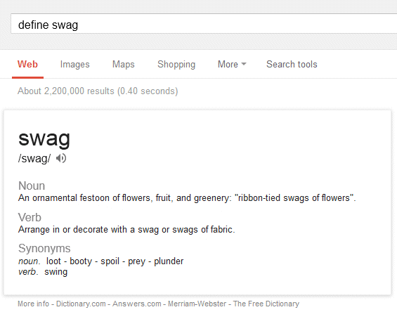
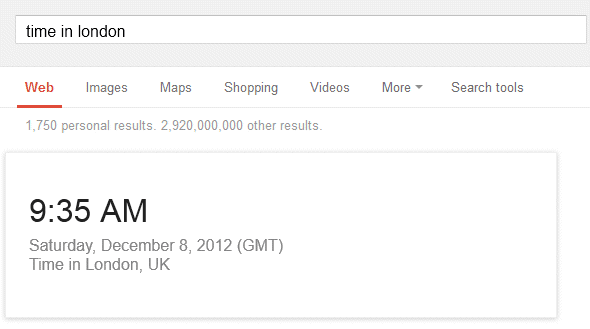
Google updated the desktop OneBoxes for definitions and local time to match the card layout from Google Now. The same layout is also used in the mobile search UI for most Google OneBoxes.
What's unique about the cards? They're much bigger, they include a lot more information, more white space and more distinctive headers. They stand out more and they're harder to ignore.
Shall there be a reason why the knowledge sidebar lacks these changes (not much whitespace, no shadow around the borders, etc.)? Is it a difference between background and more urgent information or something alike? Or is it a matter of time?

Shall there be a reason why the knowledge sidebar lacks these changes (not much whitespace, no shadow around the borders, etc.)? Is it a difference between background and more urgent information or something alike? Or is it a matter of time?
ReplyDeleteIt will probably change, as well. The mobile OneBoxes for facts and answers already use the card layout.
DeleteAnyway, so what is that "swag" word used by the Generation Z? ;-)
ReplyDelete